Coastal and Nautical Are Related, Not Interchangeable
Coastal and nautical design both look toward the water, but they create different rooms. Coastal style is usually about living near the shore: light, air, sand, relaxed texture, weathered finishes, and a sense of ease. Nautical style is more directly connected to boats, sailing, navigation, and maritime tradition, so it often uses sharper contrast, navy, brass, stripes, rope, maps, and ship-inspired details. Understanding the difference helps you choose the mood you want instead of mixing every ocean reference into one crowded room.
A: No, coastal is shore-inspired atmosphere, while nautical is more directly tied to sailing and maritime details.
A: Yes, but one should lead and the other should appear as an accent.
A: Coastal usually feels more relaxed because it relies on softness, light, and natural texture.
A: Nautical can feel more formal when it uses navy, brass, dark wood, and tailored stripes.
A: No, nautical style can come from color, materials, lighting, and charts instead.
A: No, shells are optional and often strongest in small, edited amounts.
A: Soft white works in both styles and lets texture or contrast define the direction.
A: Choose objects for material and proportion, not just ocean symbolism.
A: Yes, through quality linen, pale wood, stone, subtle lighting, and disciplined editing.
A: It works especially well in contained rooms where a sharper story feels intentional.
Coastal Style Starts With Atmosphere
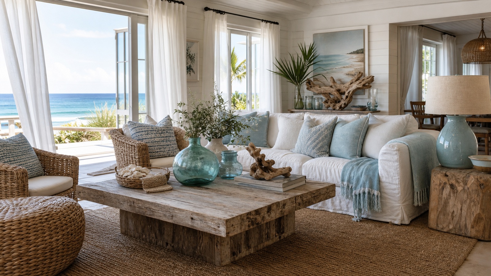
Coastal rooms often feel as if windows have been opened and salt air has softened the edges. The palette tends to be pale and natural: white, cream, sand, driftwood, shell, sea glass, soft blue, and faded green. Materials do much of the work. Linen, cotton, rattan, jute, pale wood, woven shades, and relaxed upholstery make the room feel easy without needing many literal beach objects.
The best coastal spaces are not crowded with shells and signs. They rely on light, texture, and comfort. A slipcovered sofa, a weathered table, a seagrass rug, and a few blue-green accents can communicate the mood more successfully than a room full of anchors and slogans.
Coastal design also has regional variation. A New England coastal room may feel crisp and white with dark accents. A California coastal room may feel warmer and more casual. A tropical coastal room may bring in palms, cane, and brighter color. The shared thread is openness and relation to the shore, not a fixed set of props.
Nautical Style Starts With Maritime Identity
Nautical design is more structured. It refers to sailing, ships, harbors, navigation, and uniforms. That is why navy and white, brass hardware, stripes, rope, lantern shapes, porthole mirrors, signal flags, charts, and polished wood appear so often. The room can feel tailored, historic, playful, or club-like depending on how those references are used.
Because nautical objects are recognizable, they need editing. One brass lantern, a striped cushion, and a framed chart may feel sharp and intentional. Ten anchors, rope on every surface, and repeated boat motifs can feel like a theme restaurant. Nautical design works best when the references are chosen for shape, material, or story rather than quantity.
Compare the Color Palettes
Coastal color usually begins with the beach itself. Sand, white, weathered gray, pale blue, seafoam, and driftwood brown create a softened palette. Contrast is generally low to medium, so the eye experiences the room as breezy and continuous. Even when blue appears, it often feels faded by sun and air.
Nautical color has more graphic confidence. Navy and white are the classic combination, often joined by red, brass, black, or polished wood. The effect is crisper and more deliberate. Nautical rooms can use pale colors too, but their identity often depends on contrast and repeated bands of color.
If you are unsure which direction fits your home, look at the architecture and natural light. A sun-filled room with casual furniture may welcome coastal softness. A den, bar, study, or guest room with built-ins and deeper paint may support nautical drama. The room itself often hints at which water story will feel more convincing.
A useful way to separate the palettes is to imagine the source of the color. Coastal color looks sun-faded, wind-washed, and softened by distance. Nautical color looks chosen for visibility, identity, and contrast. That distinction alone can solve many styling decisions.
Materials Tell the Story
Coastal materials feel weathered, breathable, and touched by nature. Think limed wood, woven shades, cotton throws, linen upholstery, pale ceramic, driftwood, sea grass, and matte stone. Imperfection is welcome because it suggests the slow wearing of sun, sand, and salt air.
Nautical materials feel more engineered. Brass, rope, canvas, leather, dark wood, polished nickel, striped cotton, and ship-style lighting create a more constructed world. These materials can still be relaxed, but they carry an association with equipment, craft, and maritime use.
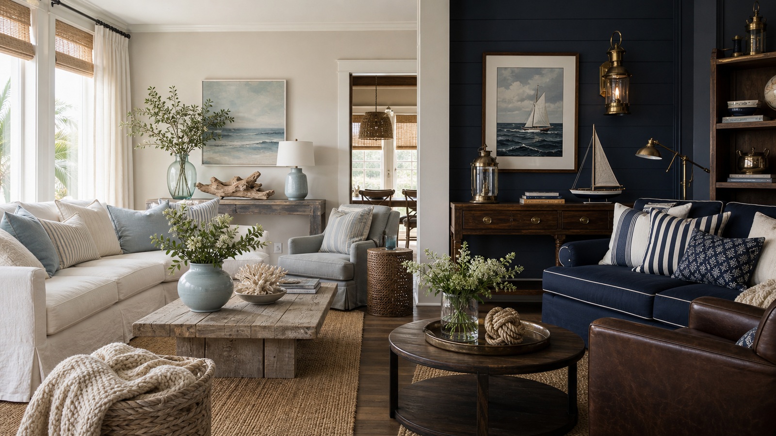
Mixing the two is possible when one material language leads. A coastal room can handle a brass lantern if the surrounding textures stay soft. A nautical room can use a jute rug if the rest of the space has enough crisp structure. Confusion happens when every material competes to declare a different theme.
Pattern and Motif Need Different Levels of Control
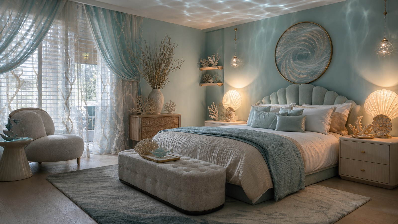
Coastal patterns are often subtle: washed stripes, block prints, faded botanicals, shell-like textures, or abstract water movement. They should feel as though they belong to fabric and light rather than announcing a symbol. Nautical patterns are more direct, especially stripes, flags, knots, charts, and sail-like geometry.
The sharper the motif, the less repetition you need. A striped rug can carry a nautical room without striped curtains, striped bedding, and striped lampshades. A coastal room can layer more texture because the patterns are quieter. This is one reason coastal design often feels easier for open-plan homes, while nautical design benefits from clear boundaries.
Choose Objects With Purpose
Decorative objects are where coastal and nautical rooms most often become cluttered. Coastal accessories might include ceramics, baskets, glass, coral-shaped forms, landscape art, or driftwood. Nautical objects might include charts, model boats, ship wheels, knots, lanterns, and brass instruments. In both cases, the object should improve the room even if the theme were removed.
A helpful test is to ask whether the piece has beauty in form, material, or memory. A handmade ceramic vase in sea-glass green can work because it contributes color and texture. A cheap sign with a beach phrase usually contributes only instruction. A vintage chart can be beautiful; a pile of generic anchor objects can feel thin.
Collections should be contained. Frame maps together, group shells in one bowl, or place maritime objects on one shelf. When themed objects are concentrated, they feel curated. When they are scattered everywhere, the room loses sophistication.
Scale also affects how motifs behave. A large striped rug can feel architectural, while many small striped objects can feel busy. A single framed chart may feel collected, while several small boat objects may feel like souvenirs. The bigger and better the gesture, the less repetition it usually needs.
Mixing Coastal and Nautical Without Confusion
Many homes benefit from a blend. You might want the airiness of coastal style with the crispness of nautical details. The cleanest approach is to make coastal the base and nautical the accent. Use pale walls, woven texture, and comfortable seating, then add navy piping, a brass sconce, striped pillows, or a framed chart.
The reverse can work too. A nautical study might use navy shelves, brass lamps, leather, and a ship-style mirror, then soften the room with a natural rug, linen curtains, and a pale ceramic lamp. The coastal elements keep the nautical story from feeling rigid.
Keep the ratio clear. When guests enter, they should sense the main mood quickly. If the room says beach house, sailing club, tropical resort, and fishing cabin all at once, editing will help. Remove the weakest references and strengthen the best ones.
Let the Room Decide the Finish
A family living room usually benefits from coastal comfort: washable fabrics, flexible seating, and textures that forgive daily use. A powder room, hallway, guest bedroom, or home bar can handle more concentrated nautical character because people experience it for shorter periods. That does not mean one is better; it means each style has a natural setting.
The most polished water-inspired rooms know what they are trying to make people feel. Coastal says breathe out, open the window, and relax. Nautical says travel, craft, direction, and tradition. Once you know which message matters most, the choices become simpler.
Use coastal design when you want lightness, ease, and natural texture. Use nautical design when you want contrast, maritime detail, and a more tailored story. Mix them only after one has been chosen as the lead, and the room will feel connected rather than overdecorated.
Hardware and lighting can be the quiet bridge between the two. A coastal kitchen with simple brass pulls can gain a hint of maritime polish without becoming nautical. A nautical room with linen shades can soften its structure without losing identity.
Match the Style to the Home's Location
A home does not have to be on the water to use either style, but location can help the design feel honest. A city apartment might use coastal texture and pale color for relief from density. A lake cottage might borrow nautical lighting and stripes without pretending to be an ocean house. A suburban guest room might use one coastal palette and avoid heavy maritime objects altogether.
When a house is actually near the shore, look at the local landscape before choosing decor. Rocky coastlines, white sand, marsh grass, harbors, and tropical beaches all suggest different materials and colors. The more the room responds to its real or imagined setting, the less it needs generic themed accessories.
Use Editing as the Final Style Tool
Coastal and nautical design both improve when the final layer is edited. Remove objects that only repeat the obvious idea. Keep the pieces that add scale, texture, usefulness, or personal memory. A room with fewer stronger references usually feels more expensive and more specific.
Editing is especially important when both styles appear together. If the base is coastal, choose two or three nautical accents and let them stand clearly. If the base is nautical, use coastal softness to make the room comfortable rather than diluting the maritime story with unrelated beach decor.
The goal is not to follow a rulebook. It is to make the room feel like it knows where it is standing. Once the mood is clear, every stripe, shell, lamp, map, basket, or blue accent has a reason to be there.
Choose the Right Level of Formality
Coastal design usually becomes more formal when the palette is crisp, the upholstery is tailored, and the accessories are minimal. Nautical design becomes more casual when stripes are softer, wood is weathered, and maritime objects feel collected rather than polished. Either style can move up or down in formality depending on the room.
This is useful when designing connected spaces. A relaxed coastal living room can lead into a sharper nautical powder room without feeling disconnected, because smaller rooms can hold a more concentrated idea. A formal dining room can borrow coastal color while using better lighting, polished tableware, and fewer rustic textures.
Think about how people behave in the room. A family room needs comfort and durability. A study can be moodier. A guest room can be atmospheric without supporting daily clutter. The style should match the room's social job.
When formality is chosen deliberately, the difference between coastal and nautical becomes easier to handle. You are no longer choosing only objects; you are choosing posture, pace, and the kind of experience the room should offer.
This is also why shopping should happen after the style decision, not before it. Once you know whether the room needs shore softness or maritime structure, the same blue pillow, brass lamp, woven rug, or framed print becomes easier to judge. The item either strengthens the chosen direction or pulls the room toward a story you did not mean to tell.