Cosmic Inspiration Works When It Becomes a System
A space or galaxy theme can look impressive in a single image, but creative projects and branding need more than a dramatic backdrop. They need a system that can repeat across materials, rooms, campaigns, packaging, events, or digital touchpoints without becoming messy. The strongest cosmic direction begins with a clear emotional promise: mystery, discovery, futuristic polish, wonder, luxury, exploration, or calm depth. Once that promise is chosen, color, light, texture, shape, and imagery can work together instead of competing for attention.
A: Yes, if the system uses restraint, strong materials, and clear hierarchy.
A: The emotional direction should come first, then color and imagery can support it.
A: No, depth can come from material, lighting, photography, and contrast.
A: Avoid generic symbols and use better texture, typography, and lighting.
A: Yes, but dark palettes need careful contrast and finish testing.
A: A controlled silver, icy blue, or soft violet often works well.
A: Only if they support the story rather than filling space.
A: Enough to guide attention, not so much that everything competes.
A: Yes, with brass, aubergine, velvet, and warm highlights.
A: A repeatable signature detail that appears across materials and spaces.
Choose the Brand Feeling Before the Space Imagery
Galaxy visuals can point in many directions. A startup may want innovation and speed. A wellness brand may want quiet night-sky calm. An event may want spectacle and arrival. A boutique product line may want deep color, metallic detail, and a sense of rarity. The images may all include stars, but the design language will change completely once the feeling is named.
This decision protects the project from using every cosmic reference at once. Planets, rockets, nebulae, constellations, black holes, moon surfaces, chrome, holographic film, and dark velvet can all be beautiful, but together they may blur the message. A brand direction becomes stronger when a few references are chosen with discipline and repeated in useful ways.
A useful first exercise is to write three words the audience should feel before they notice any specific symbol. Words like rare, vast, sleek, playful, cinematic, or serene give the project a target. If a proposed color, prop, or finish does not support those words, it probably belongs to a different version of the theme.
Build a Palette With Depth and Contrast
Most galaxy palettes start with darkness, but darkness alone is not enough. Midnight navy, charcoal, black-blue, aubergine, deep violet, and ink green create the background. Then a project needs controlled points of glow: silver, icy blue, magenta, ultraviolet, pearl, brass, or a soft white highlight. The balance between depth and light is what makes the theme feel expensive instead of flat.
For branding, the palette should work in small and large formats. A business card, social tile, event backdrop, product label, and physical sign may all need different levels of contrast. If the palette only works as a full-screen gradient, it will be difficult to use. Test solid color blocks, one accent color, and black-and-white versions before committing.
A restrained cosmic palette often feels more memorable than a rainbow nebula. Choose one dominant dark, one luminous accent, one supporting neutral, and one metallic or reflective note. That gives the theme enough range without making every surface compete.
This palette work should include ordinary production limits. A color that looks beautiful on a backlit screen may print too dark, while a metallic accent may change under event lighting. Testing the palette across real materials keeps the cosmic mood from depending on one perfect digital condition.
Turn Light Into a Signature Element
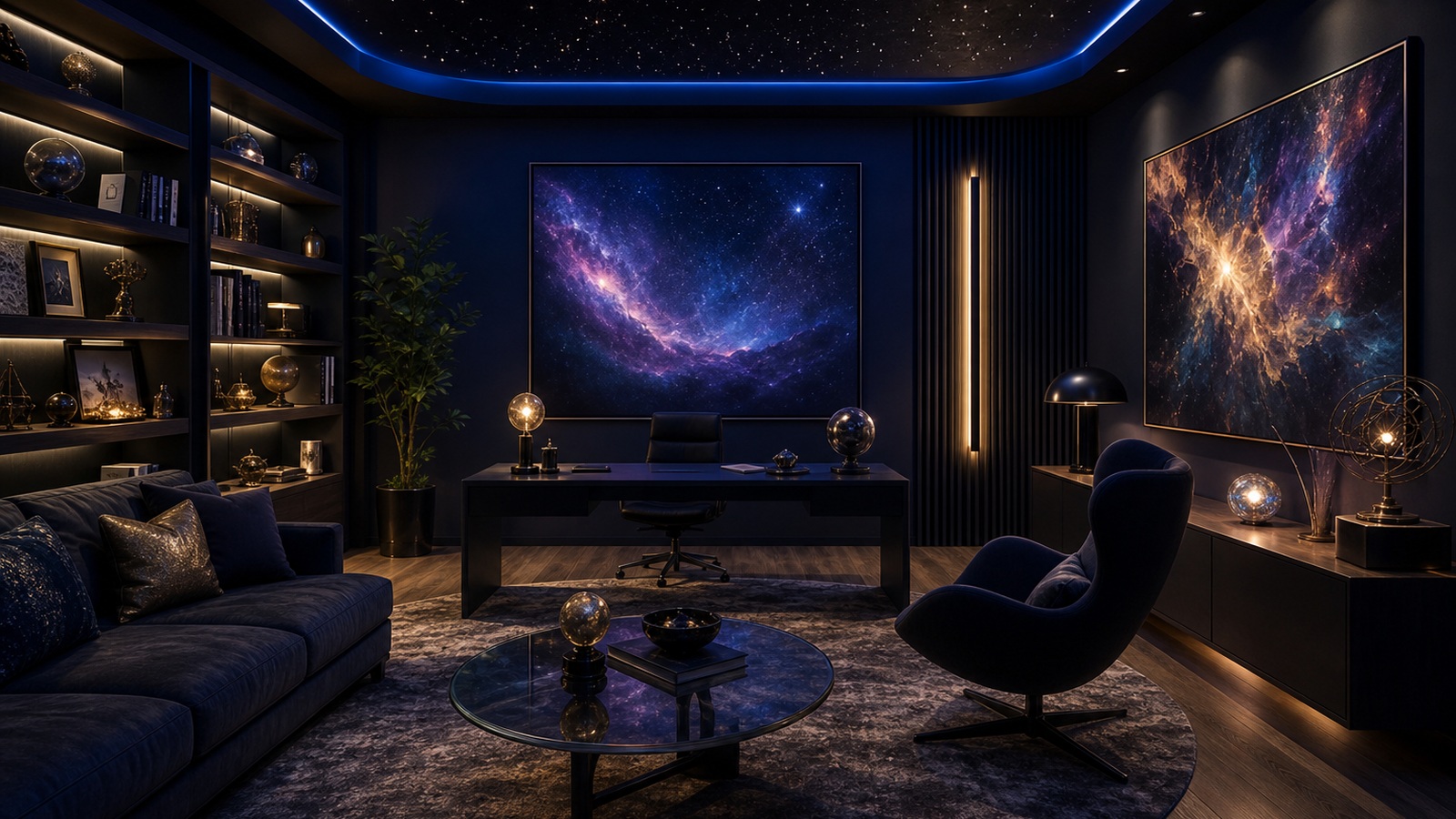
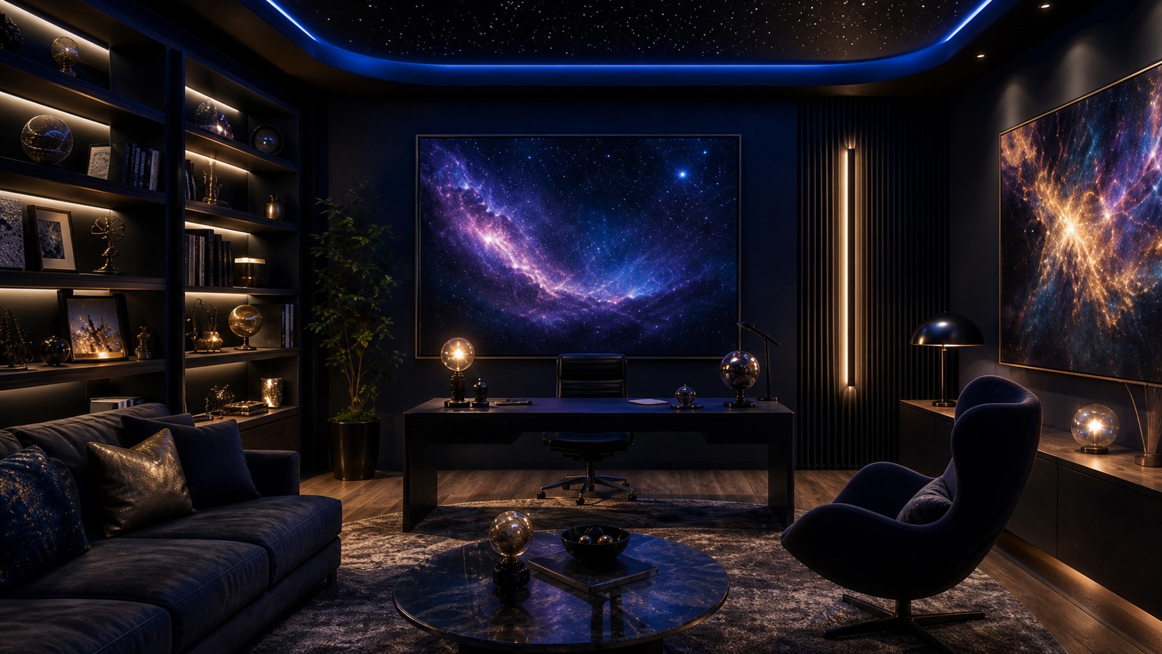
Light is one of the easiest ways to make a space or galaxy theme feel alive. Pinpoint lights, edge glow, backlit panels, reflective foil, glossy ink, translucent acrylic, and illuminated display shelves can all suggest stars or distant energy. The key is to decide how the light behaves. Is it sharp and futuristic, soft and atmospheric, or theatrical and immersive?
In physical environments, lighting can become part of navigation. A glowing entry, a lit product shelf, or a star-like ceiling moment can guide people through the project. In branding, the same idea can appear as a highlight style, foil detail, photography treatment, or animated reveal.
Avoid using glow everywhere. When every object has a luminous edge, the effect loses hierarchy. One strong lighting gesture and a few smaller echoes usually feel more intentional than constant brightness.
Use Texture to Make the Theme Feel Tangible
Galaxy themes often become too digital when they rely only on gradients and screen-like color. Texture brings the idea into the real world. Matte black paper, velvet, smoked glass, brushed metal, dark stone, ribbed acrylic, pearlized finish, and speckled ceramic can all give the theme a physical vocabulary.
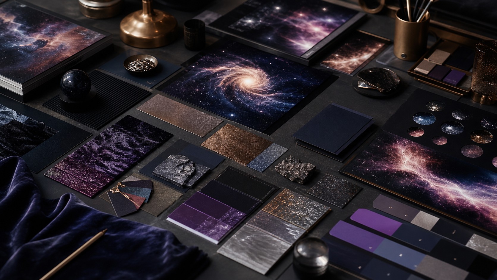
For creative projects, build a material board before finalizing the look. Place the dark base material beside the accent color, metallic finish, and any photography. If the materials still feel related under real light, the theme will be easier to translate into interiors, packaging, signage, or event props.
Texture also creates memory. People may forget a generic galaxy image, but they remember the feel of a velvet invitation, a metallic edge, a smoky glass display, or a dark wall that glows around a product. The sensory detail makes the concept stick.
Physical texture also helps people trust the project. When a dark cosmic brand includes paper, fabric, metal, stone, or glass that can be touched, the idea feels less like a temporary graphic treatment and more like a world with its own rules.
Create Visual Rules for Stars, Orbits, and Nebulae
Cosmic symbols need rules. Decide whether stars are tiny points, scattered dust, graphic icons, or photographic texture. Decide whether orbits are thin lines, circular framing devices, or motion paths. Decide whether nebulae are realistic imagery, abstract color washes, or subtle background grain. Without these rules, the project can feel assembled from unrelated space graphics.
The rules do not need to be rigid, but they should be recognizable. A brand may use only tiny white star points and one sweeping orbital curve. An event may use large nebula imagery but no planets. A room may use star-like lighting and round furniture without any printed stars at all.
These rules also make collaboration easier. A designer, fabricator, photographer, event planner, or web team can each interpret the same cosmic system without copying the exact same image. That flexibility is what turns inspiration into a usable creative language.
Adapt the Theme Across Different Project Types
A brand identity needs clarity at small scale, so the galaxy theme should reduce to color, contrast, shape, and one signature detail. A product launch can be more immersive, using light, backdrop, and material to build excitement. A creative studio or showroom can use the theme as an environment that supports work without distracting from it.
Events can take the theme further because they are temporary. A glowing entrance, dark lounge, reflective bar, and star ceiling may feel memorable for one night. Permanent interiors need more restraint. A daily workspace should borrow depth and atmosphere without turning every wall into a spectacle.
The same theme can therefore have several intensity levels. Lightest is palette and material. Medium is lighting and art. Strongest is immersive environment. Choosing the right level for the project keeps the cosmic idea useful instead of overwhelming.
This intensity scale is useful for budgets too. A light version can update a brand quickly through color and photography, while a strong version may require fabrication, lighting, and spatial planning. Knowing the level keeps ambition aligned with resources.
Keep Typography and Layout Quiet
Even though the featured images for these articles avoid readable text, real branding still needs type. In a galaxy theme, typography should usually be calm enough to let color and light carry the drama. Clean sans serif type, elegant spacing, and high contrast often work better than overly futuristic novelty fonts.
Layout should also provide breathing room. Cosmic visuals imply vastness, so crowded compositions can feel off-message. Use generous margins, clear focal points, and a strong hierarchy. A dark field with one luminous object can feel more space-like than a page filled with stars.
Avoid the Common Cosmic Clichés
The fastest way to weaken a galaxy concept is to rely on obvious clip-art symbols. Random planets, cartoon rockets, stock starbursts, and rainbow gradients can make a serious project feel generic. If the goal is playful, direct symbols may work, but they still need quality, scale, and editing.
Another mistake is confusing sci-fi with galaxy style. Chrome, grids, holograms, and neon can suggest technology, but they do not automatically create wonder. If the project is about the night sky, exploration, or deep space, preserve enough darkness, silence, and scale for that feeling to come through.
A cosmic theme becomes sophisticated when it understands restraint. Use fewer symbols, better materials, stronger light, and more considered contrast. The result can still feel imaginative, but it will not depend on novelty to be understood.
Make the Mood Board Practical
A useful mood board includes more than beautiful images. It should show color blocks, material samples, lighting references, shape cues, photographic tone, and examples of what not to do. This helps everyone involved understand the boundaries of the theme.
For a branding project, include applications at different scales. Show how the palette might work on a small card, a large wall, a product package, and a social graphic. For an event or interior, include pathways, surfaces, lighting levels, and seating or display ideas.
The board should answer design questions, not only create excitement. When a decision comes up later, the team can ask whether it belongs to the established cosmic world. That keeps the project coherent as it grows.
A mood board should also show restraint. Including one or two rejected directions can be helpful when they clarify what the project is not. A rejected neon-heavy direction, for example, may protect a premium galaxy brand from drifting into nightclub territory.
Let Wonder Stay Useful
Space and galaxy themes are powerful because they suggest scale beyond ordinary life. That sense of wonder can make a brand feel ambitious, a room feel immersive, or an event feel unforgettable. But wonder should still serve the audience. People need to read, navigate, shop, gather, relax, or remember the message.
The best creative projects use the galaxy idea as a guide, not a costume. They translate depth into hierarchy, glow into attention, texture into memory, and darkness into focus. When those pieces work together, the theme feels expansive and clear at the same time.
Start with the feeling, build the system, and edit every cosmic reference against that system. That is how a galaxy theme moves from inspiration into branding that can actually live in the world.
Design for Memory, Not Just Impact
A galaxy theme can create impact immediately, but branding and creative projects also need memory. People should remember one or two specific qualities after the visual moment passes. That might be a silver edge, a velvet dark surface, a pin-light field, a circular framing device, or a deep blue-black palette that appears across several touchpoints.
Memory improves when the signature detail is repeated with variation. The same orbital curve might appear in packaging, event lighting, and a display wall, but each version should be adapted to its material. Repetition without adaptation feels mechanical; adaptation without repetition feels disconnected.
This is why the most useful cosmic inspiration is selective. It chooses the details that can travel. A single beautiful nebula image may inspire the mood, but the brand system needs details that can survive printing, fabrication, photography, and everyday use.
The final system should have enough clarity that new decisions can be made without starting over. If a future poster, showroom wall, or product display can be judged against the same rules, the inspiration has become a true design language.
Keep the Audience in the Center
A space theme for a children's event, a luxury fragrance, a creative agency, and a technology conference should not look the same. Audience changes the level of contrast, symbolism, polish, and play. A younger audience may welcome planets and bright color, while a premium audience may respond more strongly to texture, darkness, and subtle metallic detail.
The setting matters too. A retail customer needs clarity and product focus. A party guest needs atmosphere and movement. A client seeing a brand presentation needs enough restraint to trust the system. The cosmic theme should support the audience's next action.
When the audience remains central, the theme becomes less self-indulgent. It still feels imaginative, but it helps people understand where they are, what they are meant to notice, and how the experience should feel.