The Psychology Behind Color Choices in Modern Spaces
Color is one of the most powerful, persuasive languages in design—a language spoken without words, understood without explanation, and felt long before it is consciously analyzed. In modern spaces, color is more than an aesthetic choice. It is an emotional catalyst, a behavioral cue, a sensory storyteller, and an essential instrument for shaping how people think, feel, move, and connect in the environments they inhabit. Whether in a home, a retail store, a hotel lobby, a branded office, or a gallery, the hues woven into a space can elevate moods, inspire productivity, evoke nostalgia, or create a sense of grounding. The psychology behind color choices is no longer considered an esoteric design tool—it is a foundational pillar shaping the experiential power of the modern built environment. The shift toward intentional color design aligns with broader cultural trends: the wellness movement, the rise of experiential interiors, the emphasis on human-centered environments, and the fusion of neuroscience with architectural practice. Today, designers and architects understand that color is immersive, atmospheric, and deeply intertwined with both personal memory and universal psychological responses. The modern homeowner or brand strategist—armed with increasingly accessible research on spatial psychology—seeks more than beauty. They seek resonance. And it is this pursuit that elevates the study of color from artistic choice to emotional craftsmanship.
A: Blue consistently ranks as the most soothing and mentally stabilizing.
A: No—paired with warm lighting, dark hues feel intimate, not oppressive.
A: Start with the emotional goal, then build hues that support that feeling.
A: Absolutely—light temperature can shift emotional interpretation.
A: Only when overused; small bursts create positive activation.
A: Neutrals anchor the design but benefit from colored accents.
A: Overuse of cool hues without texture or warmth in materials.
A: Yes—lighter tones and cool hues visually expand space.
A: More than 4 dominant tones can overwhelm cohesion.
A: Change accent colors—pillows, décor, small walls—fast mood shifts.
The Emotional Blueprint of Color: Why We Feel What We Feel
To understand how color shapes modern spaces, we first explore why humans respond emotionally to pigments and tones. Color perception is both physiological and psychological. At the neurological level, color stimulates the hypothalamus, triggering hormones that influence mood, alertness, and even appetite. At the psychological level, it taps into cultural symbolism, personal memories, environmental associations, and evolutionary instincts. Red may evoke passion in one person while signaling danger in another. A gray-toned minimalist living room may feel serene to some and somber to others. Color experiences are universal in their mechanisms yet personal in their individual impact.
Modern spaces lean into this complexity. Designers no longer pursue a single emotional output with color; instead, they craft environments that accommodate layered experiences—calm and focus, curiosity and grounding, energy and balance. The colors chosen for a modern home office, for example, must support concentration but also prevent burnout. Retail spaces use color to both attract attention and subtly guide shoppers through zones of discovery. Restaurants rely on warmed hues to stimulate appetite while using deeper tones to create intimacy and linger-friendly environments. Each strategic choice reflects the psychological influence color wields over human behavior.
This emotional blueprint continues to evolve as scientific research expands. Studies in environmental psychology and neuroaesthetics provide designers with quantifiable insights: warm colors increase heart rate and energy, cool tones lower stress, saturated hues boost creativity, low-contrast palettes encourage relaxation, and high-contrast palettes heighten alertness and engagement. Modern design embraces this science not as a strict rulebook, but as a palette of opportunities to craft environments that feel deeply aligned with human needs.
Warm vs. Cool Tones: The Temperature of Experience
Warm colors—reds, oranges, and yellows—activate and energize. They evoke heat, passion, urgency, sociability, and excitement. In modern spaces, warm tones are frequently used to create lively social hubs, dynamic retail displays, or invigorating accent walls that awaken a room’s personality. Yet warmth must be applied with intention. Oversaturation can become overwhelming, so modern design tempers vibrancy with muted terracottas, soft ambers, peachy neutrals, and earthy clay-inspired hues. This shift toward grounded warmth supports both energy and comfort, reflecting a desire for spaces that energize without overstimulating.
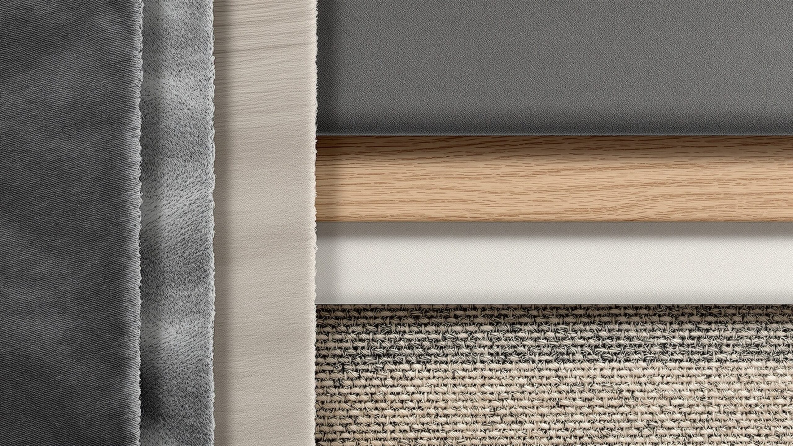
Cool colors—blues, greens, and purples—evoke calm, clarity, and serenity. They are the backbone of wellness-focused environments, meditation rooms, spas, and modern minimalist homes that seek a sense of refuge. These hues reduce stress and encourage introspection, making them ideal for bedrooms, lounges, and workspaces requiring focus. Modern designers often pair cool palettes with natural textures—stone, wood, woven materials—to avoid sterility and bring more emotional depth into calming spaces.
The interplay between warm and cool tones defines many of today’s trend-forward environments. Designers blend warm undertones with cool palettes or introduce a cool counterbalance in warm-dominated spaces to create nuanced atmospheres. This balance reflects a broader cultural desire for emotional equilibrium—a home or workspace that can energize yet soothe, inspire yet relax, uplift yet stabilize.
The Rise of Neutrals: Sophisticated Simplicity
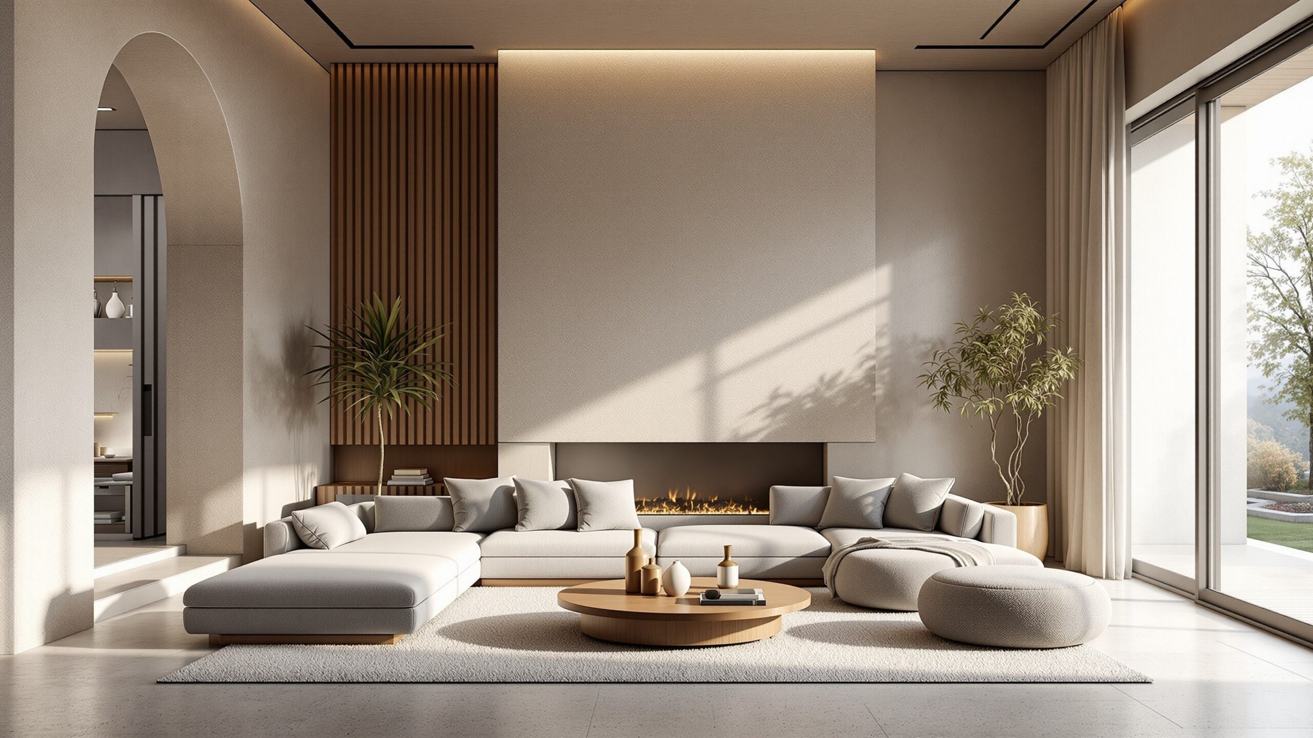
Neutrals have evolved beyond simple background players. In modern design, they are strategic, expressive, and psychologically influential. Colors like cream, beige, pearl, charcoal, sand, and taupe create a sense of calm and sophistication. They reduce cognitive load, allowing inhabitants to feel mentally clear and focused. Neutrals also amplify the effect of natural light, making rooms feel more open, balanced, and harmonious.
The psychology of neutrals lies in their ability to act as emotional stabilizers. They allow the mind to rest. In a culture increasingly overwhelmed by digital noise and hyperstimulation, neutral-based spaces provide a visual exhale. Modern minimalist and Japandi interiors lean into this principle, offering palettes that evoke purity, intention, and simplicity.
However, today’s neutral palette is richer and more dynamic than the sterile whites of the past. Warm neutrals foster comfort and connection, cooler neutrals evoke modernity and sleekness, and greige (the blend of gray and beige) creates versatile transitional spaces that can swing warm or cool depending on light and furnishings. Designers use neutrals as a canvas for emotional layering—accenting them with bolder colors to shift the mood without sacrificing serenity.
Bold Statements: The Psychology of Saturated Hues
While neutrals dominate many modern spaces, bold saturated hues have surged back as powerful tools for storytelling. Deep emerald greens signify growth, luxury, and a connection to nature. Vibrant cobalt blues evoke creativity, intelligence, and expansive thought. Mustard yellows carry a retro-modern vibe that feels optimistic and welcoming. Burgundy and wine tones add sophistication, intimacy, and artistic flair.
Bold colors require confidence, both from the designer and the inhabitant. Their psychological influence is stronger and more direct, which is precisely why modern design embraces them in targeted applications—an accent wall, a piece of furniture, a statement staircase, a kitchen backsplash, or a bold rug that anchors a room. These color choices add character and emotional richness, transforming otherwise neutral spaces into experiences rather than static environments.
Saturated hues also play a critical role in creating memorable brand identities in commercial spaces. Hotels use jewel tones to craft luxurious, immersive experiences. Restaurants use rich tones to build atmosphere and thematic storytelling. Retail spaces use high-energy saturated hues to encourage exploration and engagement. In each case, bold colors are not merely decorative—they are psychological levers shaping how people feel and behave.
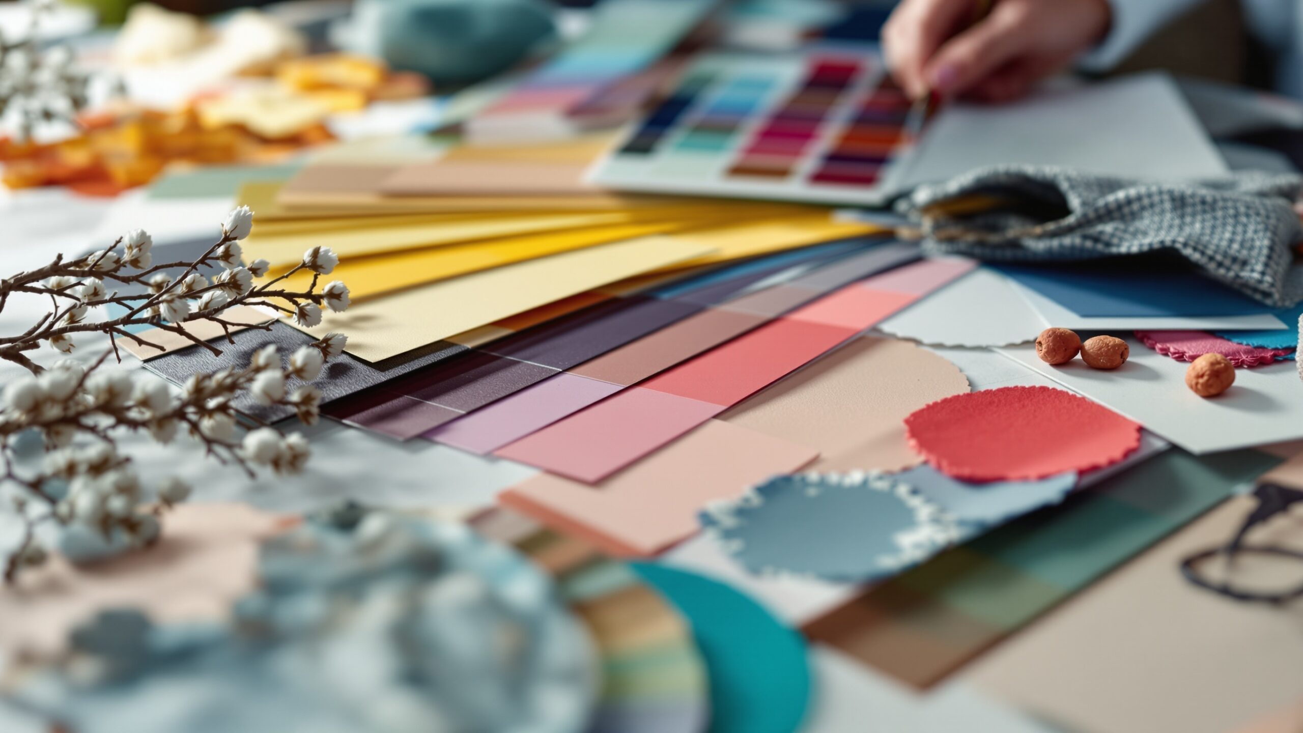
Cultural Influences and Personal Meaning: Color Beyond Science
While much of color psychology is rooted in universal human responses, culture plays an equally significant role. Colors carry symbolic meaning across regions, traditions, and historical contexts. White may symbolize purity in Western cultures but mourning in parts of East Asia. Red may represent celebration and luck in China but signal caution or urgency elsewhere. Blue is often perceived as calming globally, yet its association with trust and authority varies widely across industries and societies.
Modern spaces increasingly embrace multicultural interpretations of color. Designers draw inspiration from global palettes—Moroccan reds, Japanese indigos, Scandinavian neutrals, Mediterranean terracottas, Caribbean turquoise—to create environments rich with meaning and diversity. These cultural influences deepen the emotional resonance of a space and invite inhabitants to connect with broader human stories.
Personal meaning also shapes color perception in profound ways. A childhood memory may imbue yellow with warmth and nostalgia for one person while another associates it with discomfort or overstimulation. Designers often encourage clients to explore personal histories, moods, and sensory preferences to craft spaces that feel authentically theirs. The psychology behind color choices becomes a deeply personal journey—one that integrates universal theories with individual life experiences.
Color and Natural Light: A Relationship That Shapes Perception
In modern spaces, color psychology is inseparable from the influence of natural light. A paint swatch under a fluorescent bulb is not the same color at sunrise, midday, or dusk. Light temperature, intensity, direction, and consistency dramatically affect how color appears, and therefore how it makes people feel. Designers meticulously study natural light patterns when choosing color palettes.
Warm natural light enhances warm tones, making spaces feel inviting and golden. North-facing rooms, which receive cooler light, benefit from warmer palettes that counterbalance chilliness. Rooms with abundant daylight can support more saturated colors without feeling heavy, while low-light spaces often shine with lighter or pastel palettes.
This relationship between color and light influences energy levels and emotional responses. Bright, light-filled rooms painted in airy hues evoke expansiveness, hope, and mental clarity. Deep colors in low-lit spaces create intimacy, reflection, and drama. Today’s designers often use this interplay intentionally to shift moods throughout a home or office—from invigorating morning spaces to calming evening retreats.
Biophilic Color Psychology: Nature’s Palette in Modern Design
The modern movement toward wellness and nature-infused environments fuels the rise of biophilic design—a philosophy that seeks to deepen the human-nature connection through natural textures, materials, and colors. Biophilic color psychology draws from forests, oceans, deserts, and skies to evoke calm, balance, and a sense of grounding.
Earthy greens soothe the nervous system, improve focus, and create a sense of renewal. Sandy beiges and warm browns evoke warmth, stability, and earthiness. Soft blues recall open skies and still water, reducing anxiety and promoting mental clarity. Terracottas and rusts bring warmth and natural richness, grounding modern spaces while adding sensory depth.
These nature-inspired palettes resonate emotionally because they reflect environments humans evolved in. The psychological benefits—reduced stress, heightened creativity, and improved well-being—align with deeper biological instincts. In modern spaces, biophilic colors serve as visual anchors that reconnect people with the rhythms and textures of the natural world, even in urban settings.
Color in Workspaces: Designing for Focus, Creativity, and Well-Being
The psychology of color plays a pivotal role in modern office design, where environments must support productivity, collaboration, and overall well-being. Blue remains a foundational choice for focus-driven work because it enhances concentration, lowers stress, and encourages clear thinking. Green supports long-term productivity by reducing mental fatigue and offering restful visual balance.
Creative zones often incorporate bold hues such as yellow for inspiration, coral for warmth, and turquoise for imagination. These colors stimulate neural activity, spark new ideas, and encourage dynamic brainstorming. In contrast, restful work zones—quiet libraries, individual pods, or recharge rooms—use soft neutrals, muted blues, and subdued greens to invite stillness and recovery.
Remote work culture has also redefined color psychology. Home offices now balance productivity with emotional comfort. Many choose warm neutrals for grounding, cool blues for focus, and pops of energizing colors like mustard or teal to create visual interest. Designers understand that workspace colors must align with both function and personality since these environments shape daily emotional rhythms.
Color in Hospitality and Retail: Guiding Emotions and Behaviors
Hotels, restaurants, and retail environments use color precisely because it influences behavior on a subconscious level. Hospitality spaces seek to craft emotional journeys—welcoming entryways, calming rooms, vibrant lounges, or seductive bars. Warm earthy colors create comfort in lobbies; cool tones provide spa-like calm in suites; and rich jewel tones elevate bar areas into dramatic nighttime destinations.
Retail spaces use color psychology to encourage exploration, increase time spent in a shop, and guide purchasing behavior. Bright colors draw attention and create focal points. Soft colors slow pacing and increase browsing comfort. High-contrast palettes energize consumers and invite interaction, while muted palettes create a sense of luxury and exclusivity.
In both hospitality and retail design, color becomes a form of emotional choreography. It influences not only how spaces look but how people move within them, how long they stay, what they feel, and how they remember the experience.
The Future of Color Psychology in Modern Spaces
As technology evolves, so does the application of color psychology. Smart lighting allows for dynamic color temperature shifts that adapt to circadian rhythms, creating healthier environments. Digital and AR tools help designers visualize emotional impacts in real time. Color-changing surfaces and LED integrations allow for spaces that transform mood on demand—energizing in the morning, soothing at night.
Color trends continue to evolve with cultural shifts. Periods of uncertainty often bring softer, grounding palettes. Times of innovation spark bold, expressive hues. As environmental consciousness grows, nature-inspired palettes and sustainable pigments gain prominence. And as society becomes more diverse, multicultural influences enrich the global color vocabulary.
Yet no matter how technology and trends advance, the psychological core of color remains timeless. Humans will always respond to hues on instinctive, emotional, and experiential levels. Modern design simply sharpens the tools needed to harness this power.
Color as the Silent Architect of Emotion
Color is a storyteller, a mood shaper, and the silent architect that defines how modern spaces feel. It influences behavior, shapes identity, and deepens our connection to the environments we inhabit. The psychology behind color choices is not merely about aesthetics—it is about designing emotional experiences with intention, empathy, and creativity. In today’s modern spaces, color is more than a finishing touch. It is the foundation of experiential design. Whether bold or neutral, warm or cool, nature-inspired or avant-garde, color choices reflect the evolving relationship between people and their environments. As designers, homeowners, and brands continue to prioritize emotional resonance, color remains the most powerful—and timeless—tool for crafting spaces that inspire, uplift, soothe, and transform.