Why Neutrals Matter More Than Ever in Interior Themes
Neutral tones have always had a quiet power, but in today’s rapidly shifting world of design, they have evolved into something far more compelling than a safe backdrop. Neutrals are no longer supporting characters; they are the emotional core, the visual anchor, and the transformative force behind modern interior themes. As lifestyles accelerate, spaces shrink, and design trends accelerate faster than ever, neutrals offer something priceless: calm, clarity, flexibility, and timelessness. They adapt to modern architecture, they elevate sensory experiences, and they invite personal expression without overwhelming the senses. The renewed obsession with neutrals is not simply aesthetic; it’s psychological, functional, and cultural. They soothe overstimulated minds, balance overstretched digital lives, and create environments that can evolve with us instead of locking us into a rigid theme. Whether used in minimalist spaces, immersive themed interiors, wellness retreats, or luxurious contemporary homes, neutrals offer a versatility that is unmatched. Their subtlety doesn’t diminish their impact—if anything, it amplifies it. From soft taupes and warm sands to deep charcoals, muted olives, creamy linens, and misty greiges, neutrals have broadened into a rich universe of tones, each with its own personality. Today’s neutrals aren’t beige limitations; they are an expansive design language. As interior themes diversify—biophilic, sensory-driven, luxe modern, rustic revival, Japandi, and bespoke theatrical styles—neutrals have risen to become the foundation every designer trusts. And as homeowners chase both comfort and sophistication, neutrals deliver a level of depth and emotional resonance that bold colors often can’t sustain long-term. This is why neutrals matter more than ever. They reflect who we are, how we live, and what we need from our environments. They ground us. They create harmony. And they allow creativity to flourish in every direction.
A: Not when layered with texture, depth, and natural materials.
A: Greige — the perfect blend of gray and beige suits nearly any space.
A: Absolutely — neutrals make accent colors more vibrant and intentional.
A: Yes — they expand visual space and reduce shadow heaviness.
A: They’re trending when paired with modern, minimalist architecture.
A: Coordinating tones is great — matching exactly can look flat.
A: Yes — mixing adds dimension when done with balanced ratios.
A: More than any other palette — they withstand trend cycles.
A: Warm white lighting (2700–3000K) enhances all neutral tones beautifully.
A: With durable materials and layered tones, they hide wear surprisingly well.
1. The Psychological Power of Calm: Why Neutrals Speak to the Modern Mind
The last decade has redefined how we view home. It became an office, sanctuary, social space, learning environment, fitness zone, and emotional container. Against this backdrop of complexity, neutrals stepped forward as the emotional reset button. Soft greys, creamy beiges, airy whites, and pale stone hues create visual stillness—a mental exhale after a day of sensory overload.
Neutrals promote psychological decompression. Unlike bold colors, which stimulate the mind and heighten visual awareness, neutrals lower cognitive demand, allowing the eye to rest and the brain to shift into a more peaceful state. This aligns naturally with wellness-driven interiors, where design supports mental clarity, mindfulness, and emotional balance. In fact, modern occupants crave spaces that help them transition between states—work to rest, screen time to downtime, stress to calm—and neutrals facilitate that shift seamlessly.
Moreover, neutral palettes remain congruent with circadian rhythms. Their soft tones reflect natural light in ways that mimic the gentle transitions of dawn, dusk, and daytime brightness. This creates interiors that feel aligned with nature rather than disconnected from it. Whether you’re designing a cozy bedroom, a contemplative study, or a spa-inspired bathroom, neutrals create an atmosphere where restoration comes naturally.
2. A Timeless Foundation in a Trend-Filled Era
Design trends today move at lightning speed, driven by social platforms, visual culture, and fast-paced global design influences. What was “in” last season may feel dated within a year. Neutrals break this cycle by offering a foundation that doesn’t expire. Their timelessness builds longevity into an interior theme, allowing spaces to feel modern and relevant for decades rather than moments.
Neutrals create breathing room for experimentation. A neutral base—floors, walls, upholstery—means a homeowner or designer can adapt stylistic layers over time without major renovation. A room with neutral fundamentals can shift from Scandinavian simplicity to desert modernism, from coastal chic to industrial luxury, with nothing more than a refresh of accents, textures, or furnishings. Even in immersive themed spaces, neutrals play a critical role. They prevent thematic elements from becoming overwhelming, tempering bold design choices and ensuring themes remain cohesive instead of chaotic. Neutral tones unify spaces in open-concept layouts, creating continuity from area to area without sacrificing personality. Designers rely on them as the backbone of visual storytelling, knowing that no matter how styles evolve, neutrals will remain the thread that ties the narrative together. In a world obsessed with novelty, neutrals are the anchor offering continuity, stability, and ageless elegance.
3. The Quiet Strength of Versatility: Neutrals Adapt to Any Theme
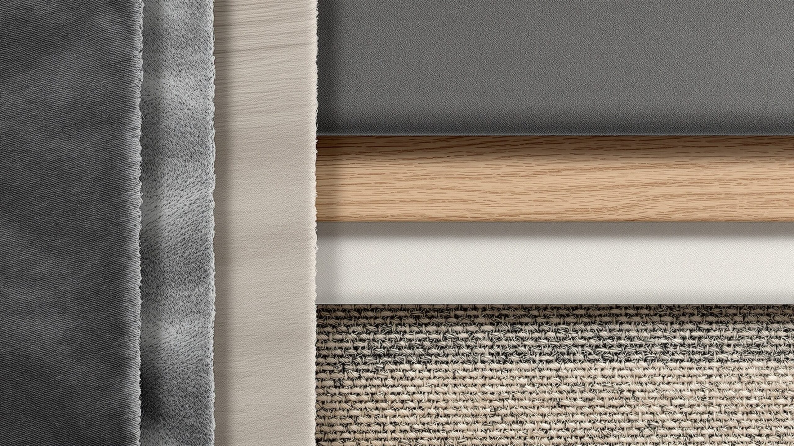
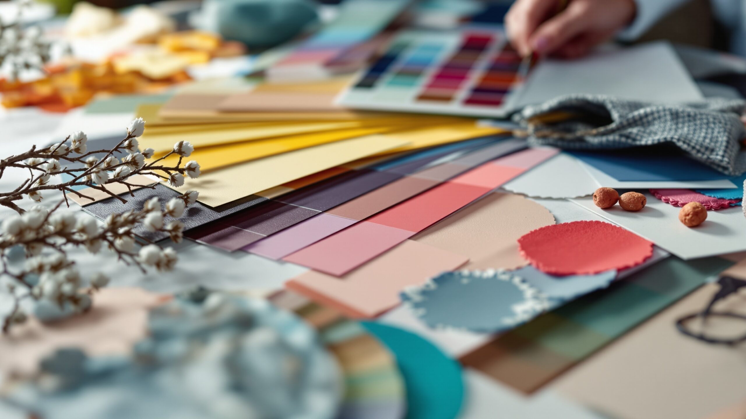
Perhaps the biggest misconception about neutrals is that they lack character. But in reality, they are the most expressive tones in a designer’s palette. Their versatility allows them to shape-shift depending on the theme, mood, or style of the space.
Warm neutrals—like caramel, biscuit, creamy ivory, and muted clay—instantly create inviting, comforting environments. They pair beautifully with organic materials like wood, linen, and rattan, making them essential to biophilic, rustic, Mediterranean, and boho-inspired themes.
Cool neutrals—like shadow grey, charcoal, pewter, and fog—evoke sophistication and sleekness, complementing urban lofts, minimalist architecture, modern-luxury concepts, and monochromatic design.
Earth-driven neutrals—olive haze, mushroom taupe, stone, and moss—blend effortlessly with natural textures, giving spaces a sense of grounded harmony.
Neutral whites—milky, matte, cloud, porcelain, and bone—open up rooms, enhance brightness, and create gallery-like backdrops that elevate art, furnishings, and architectural elements.
This chameleon ability lets neutrals behave like a canvas for thematic design. They don’t compete; they collaborate. They’re the rare tones that can amplify dramatic accents while still maintaining visual serenity. If a designer wants to highlight a bold furniture piece, a sculptural lighting fixture, a textured feature wall, or layered textiles, neutrals provide the uncluttered visual landscape needed for those choices to shine.
4. The Rise of Sensory Design and Why Neutrals Are Essential
Modern interiors have shifted from merely looking beautiful to feeling meaningful. Designers are increasingly crafting sensory-driven spaces—rooms that consider light, temperature, sound, texture, aroma, and emotional resonance. Neutrals are uniquely suited to this approach because they allow texture and materiality to take center stage.
In a neutral space, texture becomes the star. Woven linens, brushed metals, clay ceramics, veined stone, matte finishes, wool rugs, plaster walls, and raw wood grains all gain prominence. Without loud color competing for attention, the eye begins to appreciate the subtle contrast between surfaces. This creates a tactile richness that invites touch, interaction, and deeper sensory engagement.
Neutral palettes also heighten awareness of natural light. They absorb and reflect sunlight in nuanced ways, creating dynamic shifts throughout the day that breathe life into the space. Morning light washes a neutral room in softness, while evening shadows add moody depth.
This emotional and sensory dimension is one reason high-end hospitality, wellness environments, and modern luxury homes rely so heavily on neutrals. They allow the senses to feel grounded, welcomed, and soothed. In a culture where overstimulation is constant, sensory design rooted in neutrals meets a profound and growing human need.
5. The Sustainable Shift: Why Neutrals Align with Eco-Minded Design
The global conversation around sustainability has heavily influenced interior design choices. Consumers are investing in fewer, better, longer-lasting pieces. They’re choosing natural, ethically sourced, and eco-friendly materials. Neutrals align perfectly with this shift, not just stylistically but conceptually.
Natural materials—from stone and clay to jute, cotton, wood, and wool—naturally carry neutral tones. When builders and designers lean toward organic materials, neutral color palettes emerge organically. This synergy reinforces sustainability by encouraging selections that reduce chemical dyes, synthetic finishes, and trend-driven waste.
Neutrals also enhance the longevity of design choices. A neutral sofa lasts culturally longer than a bright, trend-colored statement piece. Neutral walls eliminate the need for frequent repainting driven by shifting color cycles. A space built around neutrals requires fewer full-scale remodels, reducing environmental impact over time.
This sustainability is not only ecological but emotional. People connect more deeply with spaces that feel natural, grounded, and enduring. By using neutrals, designers create interiors that age gracefully, both physically and stylistically.
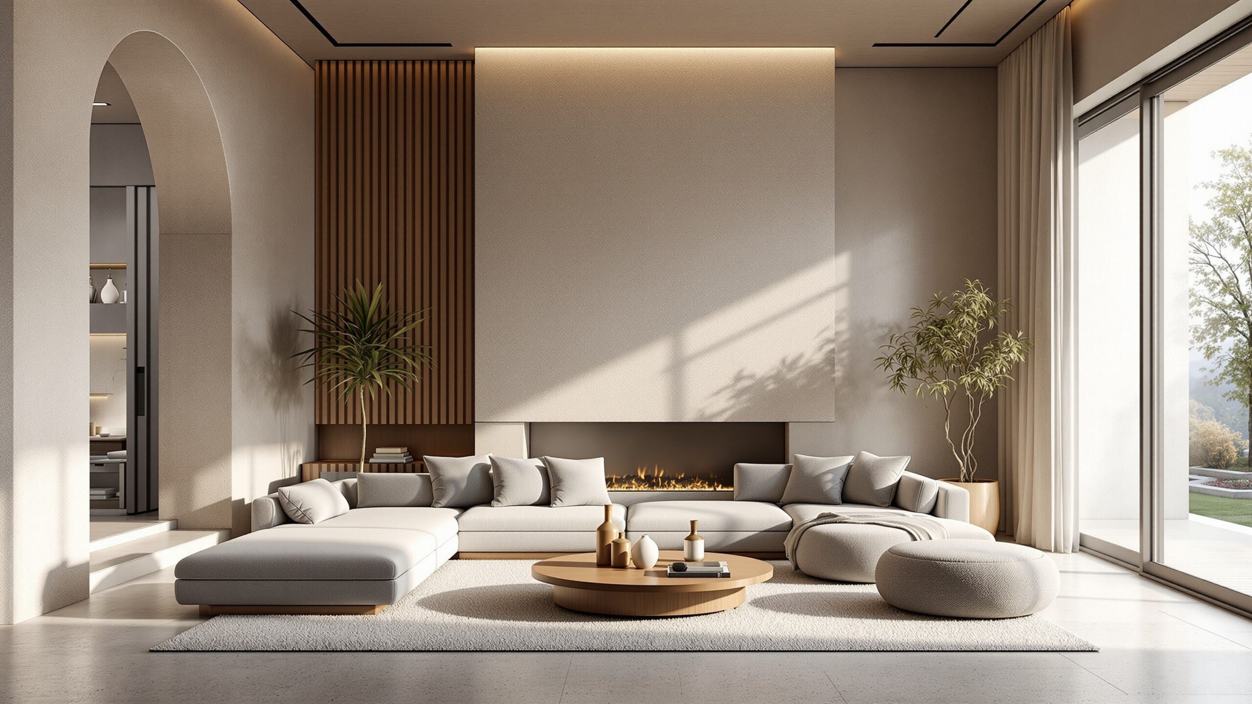
6. The Luxury Effect: How Neutrals Create an Elevated Aesthetic
Luxury in the modern era is not defined by extravagance or opulence—it’s defined by intentional refinement. High-end interiors have increasingly gravitated toward neutral palettes because they create an elevated, understated aesthetic that feels exclusive without appearing excessive.
Neutrals allow premium materials to command attention. Marble veining becomes more dramatic, brass fixtures gleam with more warmth, and organic textures like bouclé, suede, and velvet become richer. Luxury today is tactile, atmospheric, and emotional; neutrals heighten those characteristics.
Soft monochromatic palettes—sand layered over camel, stone layered over warm grey—create visual harmony that feels sophisticated and curated. This “quiet luxury” aesthetic has become dominant in global design, from boutique hotels in Europe to modern desert retreats to urban penthouses.
Neutrals also photograph exceptionally well, which is crucial in the age of social media and digital-first design portfolios. Their ability to reflect light and create material depth makes them the preferred choice for commercial spaces, luxury real estate, interior design showcases, and thematic installations.
7. The Influence of Global Design Styles
The resurgence of neutrals reflects a deeper global design evolution. Around the world, neutral-centric design philosophies have shaped the contemporary palette.
Scandinavian minimalism celebrates simplicity, functionality, and light. Japanese wabi-sabi embraces imperfection, natural materials, and serenity. Mediterranean interiors pair earthy tones with textured plaster and warm stone. Modern desert design draws from sand, clay, and sunbaked landscapes. All of these styles have heavily shaped global aesthetics, reinforcing the importance of neutrals.
Even dramatic design movements—industrial, art deco revival, contemporary luxe—use neutrals to balance bold structure with visual softness. As global design becomes increasingly interconnected, neutrals have emerged as the universal language across cultures and styles. They transcend borders because they mimic the colors of the earth, the sky, the natural world—the elements humans instinctively find calming and familiar.
This cultural cross-pollination has made neutrals more dynamic than ever. They’re not restricted to beige and grey; they now represent a spectrum influenced by global palettes, giving designers endless room to interpret and innovate.
8. The Perfect Backdrop for Personalized Style
One of the strongest design shifts in recent years is the move toward deeply personalized interiors. People want their spaces to express individuality, history, and meaning. Neutrals make this possible by stepping back and allowing personal artifacts, meaningful décor, and signature accents to take center stage.
A neutral theme never competes with art collections, heirloom pieces, bold accessories, or seasonal décor changes. Instead, it enhances them. Because neutrals create visual balance, they allow splashes of color to feel intentional rather than chaotic. A single emerald pillow, indigo vase, terracotta sculpture, or mustard throw becomes immediately striking against a neutral foundation.
For collectors, creatives, and theme enthusiasts, neutrals allow a space to evolve continuously without losing cohesion. This adaptability speaks directly to modern living, where personal interests shift, décor trends evolve, and lifestyles change. Neutrals give the occupant control, turning the home into a personal gallery that can be rearranged without the constraints of bold, dominating color schemes.
9. The Visual Flow Advantage in Open-Concept Interiors
As open-concept layouts dominate modern architecture, creating cohesive visual flow has become a critical challenge. Multiple zones must feel connected while still retaining purpose. Neutrals offer a seamless solution.
A unified neutral palette ties together kitchens, living rooms, dining areas, and entryways, making the entire space feel larger, more cohesive, and more luxurious. Subtle variations—warm whites in the kitchen, taupe in the living room, charcoal accents in the dining area—create dimension without visual fragmentation.
In themed spaces, neutrals provide the continuity needed to transition between different zones or experiences smoothly. They establish a visual rhythm that enhances architectural lines, natural lighting, and spatial proportions. Without them, open layouts can easily feel disjointed or cluttered.
As more designers embrace storytelling within interiors, neutrals create the narrative thread that holds the story together.
10. The Future of Neutrals: Evolving, Expanding, and Becoming More Expressive
Neutrals are not static; they are constantly evolving. The next chapter in neutral design is not about minimalism—it’s about depth, character, and emotion. The future brings deeper ivories, clay-tone whites, warm browns, textured neutrals, greiges with personality, and desaturated earthy greens that feel organic yet modern.
Designers anticipate a rise in tone-on-tone layering, where spaces feel immersive through contrast in texture rather than color. Expect greater experimentation with matte finishes, limewash, Venetian plaster, raw stone, and natural textiles. Neutrals will also play a major role in smart-home design, where lighting systems shift color temperature throughout the day, enhancing the warmth or coolness of neutral palettes dynamically.
Even in bold thematic design—cosmic interiors, retro revival, coastal escape, cinematic rooms—neutrals will continue to serve as the grounding layer that allows imagination to expand without overwhelming the occupant.
Neutrals are not fading into the background. They are stepping into a richer, more expressive spotlight.
Neutrals Are the New Narrative of Modern Living
Neutrals matter more than ever because they support everything modern life demands—wellness, flexibility, stability, sustainability, creativity, and timeless beauty. They align with the rhythms of nature, enhance sensory design, and ground us emotionally in spaces that often carry the weight of our hectic days. They adapt to every theme, elevate every material, and quietly hold together the story we want our interiors to tell. As interior themes evolve and design continues its rapid innovation, neutrals remain the constant force shaping spaces that feel intentional, immersive, and deeply human. They prove that simplicity is not a lack of imagination but a pathway to endless possibility. Neutrals don’t just look good—they feel right. And in the world of modern design, that is more valuable than ever.